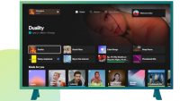
Spotify Redesigns TV Interface to Better Match Its Mobile App
November 15, 2023
Sweden-based digital music service Spotify has redesigned its television user interface to make it look and feel more like the platform’s desktop and mobile experiences, a move its users have been waiting for. The frequently played content now appears at the top of the interface, while playlists and favorites are also easily accessed. A playback queue that opens from the side of the screen lets you see what’s playing and program what’s coming up, and you can easily switch accounts by toggling profile options. A dark mode option has been added for the television interface as well.
“Spotify says the updated app is coming to both free and Premium users on compatible smart TVs, gaming consoles, and media streaming devices,” writes The Verge, which reports that the previous TV app “was a little harder to navigate, leading some users to open Spotify on their phones and control what’s playing from there.”

In June, Spotify revamped its mobile and desktop apps, indicating the streaming platform is striving to improve the experience for music and podcast listeners across the board. In addition to simplifying while adding features, the update aims to make content discovery easier, Spotify explains in a newsroom post.
The Now Playing view gives TV users more control over upcoming content in their queue, writes TechRadar, which notes that “prior to this, listeners couldn’t change anything. They could only see what was coming up.”
The Dark Mode feature, meanwhile, “is finally coming to the TV app,” TechRadar reports, explaining that “activating the mode will ‘dim the screen and tune down the visuals,’” while the background images will be “replaced with a pitch-black display.”
“What you’ll see are the music player controls, the song name, the artist performing it, as well as an About The Artist section at the bottom,” notes TechRadar.
BGR points out that with the TV and other recent GUI updates, “it seems that Spotify is trying to blend the long-beloved audio experience with the video one as well,” a move that conforms with Spotify’s recent “push to get video podcasts on its service, so I wouldn’t be surprised to see the company highlighting video versions of podcasts — especially on the TV app. I’m sure the company would love for you to watch them there instead of on YouTube.”
“A few images and a brief video shared by Spotify offer a better look at the revamp,” writes 9to5Google, adding that “the new design is already live on Google TV, presumably via a server-side change,” emphasizing “a noteworthy change is that, when you open the ‘Now Playing’ screen on the TV, music automatically starts on the TV even if it is playing on another device.”

No Comments Yet
You can be the first to comment!
Leave a comment
You must be logged in to post a comment.